
Landed here surfing through various amazing websites, wondering how they are designed?
Interested in front-end development, but just a beginner?
You are at the right place!
It’s never too late to start. So let’s get started.
1 Introduction to HTML, CSS and BOOTSTRAP
1.1 HTML
Hyper Text Markup Language was created by Tim Berners-Lee in 1991, is a markup language used for structuring and presenting content on Web.
- Created to build the structure of the website.
- Consists of several elements represented by tags.
- These elements are rendered on the browsers in form of viewable content.
1.2 CSS
Cascading Style Sheets (CSS) is a simple language created to style the HTML elements.
- Styling can be done using tag names, class names and id’s assigned to various elements in our HTML document.
1.3 BOOTSTRAP
Bootstrap is a very popular and useful framework of HTML, CSS and JS for creating responsive website designs.
- It has inbuilt HTML, CSS based designs for different elements like button, divisions, images, lists, tables and many more; which can be directly used to create a responsive design very fast.
2 BOOTSTRAP basics
2.1 Bootstrap GRID
Bootstrap gridding system divides the page into 12 identical columns and multiple rows, which you can use to place HTML elements. More than 1 column(s) can be combined to achieve more width.
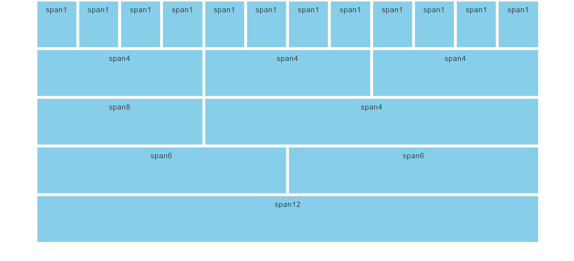
The gridding system consists of 4 classes:
xs – for screens less than 768px width
sm – for screens equal to or greater than 768px width
md – for screens equal to or greater than 992px width
lg – for screens equal to or greater than 1200px width
example:
<div class="row">
  <div class="col-sm-4">...</div>
  <div class="col-sm-8">...</div>
</div>
here you can verify there are two columns having a
span on 4 and 8 columns of the bootstrap grid system adding up to 12
2.2 Bootstrap classes
Contextual inbuilt classes can be used on different HTML elements to style them without having to write CSS code ourselves(you can assume that CSS is already written for the classes we are using). In this section we will discuss some important contextual classes provided by bootstrap.
- Classes for div containers
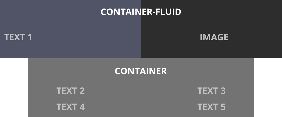
.container and .container-fluid are the bootstrap classes which can be assigned to a container div
.container sets the division width less than screen width by rendering left and right margins.
.container-fluid sets the division width= screen width.
- Classes for background color
.bg-primary, .bg-success, .bg-info, .bg-warning, .bg-danger
background color will automatically appear for the particular element when you assign any of these classes for it. - Classes for text color
.text-muted, .text-primary, .text-success, .text-info, .text-warning, .text-danger
text color will automatically appear for the particular element when you assign any of these classes for it. - Classes for button
.btn,.btn-default,.btn-primary,.btn-success,.btn-info,.btn-warning,.btn-danger,.btn-link
button color will automatically appear for the particular button, when you assign any of these classes for it..btn-lg,
.btn-sm,
.btn-xs
any of these classes when assigned to a button, resizes the button.
These are some of the important classes we discussed. Bootstrap provides many more classes for many other elements. We will be using these classes and introduce other classes further.
2.3 Modifying style using CSS
After use of contextual classes that bootstrap provides, you might be feeling limited in no. of options. For example; for text coloring using class, the range of colors that bootstrap provides is very less (red(danger) ,yellow(warning) ,green(success) … etc). also, the other styling is very particular, like the button border, border-radius, font etc. The question is, do we have to work with these restrictions? This way, all the websites made using bootstrap will look identical with just changes in the content.
Fortunately this doesn’t happen. We can do all types of styling changes using CSS. We just have to assign a different class(not bootstrap classes) to the target element and set/update any CSS property of our choice. The CSS will be rendered on the target element.

example:
<div class="container">
<p>we are modifying CSS of a button.</p>
<button class="btn btn-lg btn-danger colorchange"></button>
</div>
<style>
.colorchange{
  background-color: #000000;
  border-radius: 20px;
}
.colorchange:hover{
  background-color: green;
  transition:0.7s;
}
</style>
After a brief intro to the languages and frameworks we will be using further and learning bootstrap basics, lets get our hands on and start making a beautiful static responsive website.
3 Let’s start building 😉
Prerequisites
- Basics of HTML and CSS
- Some theory about bootstrap that we discussed above
3.1 Setting up environment to start off
Directory structure will be like-
Project folder
- index.html
- style.css
- assets folder (containing images to be used)
To start off, all you need is a text editor. I prefer Brackets text editor because it comes along with autocomplete feature, which saves time and I’ll be using Brackets throughout. There are several alternatives to brackets like sublime text editor, atom etc.
Another requirement to start off is Bootstrap.
- You can download it from getbootstrap.com
- or you can use bootstrap CDN(which I’ll be doing).
- NOTE: If you use CDN, internet connection will be needed for bootstrap to do the rendering.
<link rel="stylesheet" href="https://maxcdn.bootstrapcdn.com/bootstrap/3.4.1/css/bootstrap.min.css">
<script src="https://ajax.googleapis.com/ajax/libs/jquery/3.4.1/jquery.min.js"></script>
<script src="https://maxcdn.bootstrapcdn.com/bootstrap/3.4.1/js/bootstrap.min.js"></script>- another font-awesome CDN is to be included in our html file. The various icons that we will include in our website(in following sections) uses this.
<link rel="stylesheet" href="https://cdnjs.cloudflare.com/ajax/libs/font-awesome/4.7.0/css/font-awesome.min.css">you can copy these CDNs in the head tag.
Setting up
index.html to begin.
<html>
   <head>
     <meta charset="utf-8">
     <meta name="viewport" content="width=device-width, initial-scale=1">
     <link rel="stylesheet" href="https://maxcdn.bootstrapcdn.com/bootstrap/3.4.1/css/bootstrap.min.css">
     <script src="https://ajax.googleapis.com/ajax/libs/jquery/3.4.1/jquery.min.js"></script>
     <script src="https://maxcdn.bootstrapcdn.com/bootstrap/3.4.1/js/bootstrap.min.js"></script>
     <link rel="stylesheet" href="https://cdnjs.cloudflare.com/ajax/libs/font-awesome/4.7.0/css/font-awesome.min.css">
     <link rel="stylesheet" href="./style.css">
     <title>
       My first Bootstrap Template.
     </title>
   </head>
   <body>
   </body>
   </html>
meta tag is used for proper zooming and rendering during the first load of the page on browser. Test run index.html once. Now we have set up the environment required for making our website.
Don’t forget to link your CSS file to this in head tag.
3.2 Making different sections
The sections we will be building will be:
- HOME
- GALLERY
- TEAM
- CONTACT
Now, I’ll provide you the source code used. Notice the Bootstrap classes being used. Also watch the styling changes that I’m making in the CSS file to change the designs of the target elements. All sections here, are child elements of body tag. You can use my source code given below. Feel free to work around with your own ideas and tweaking.
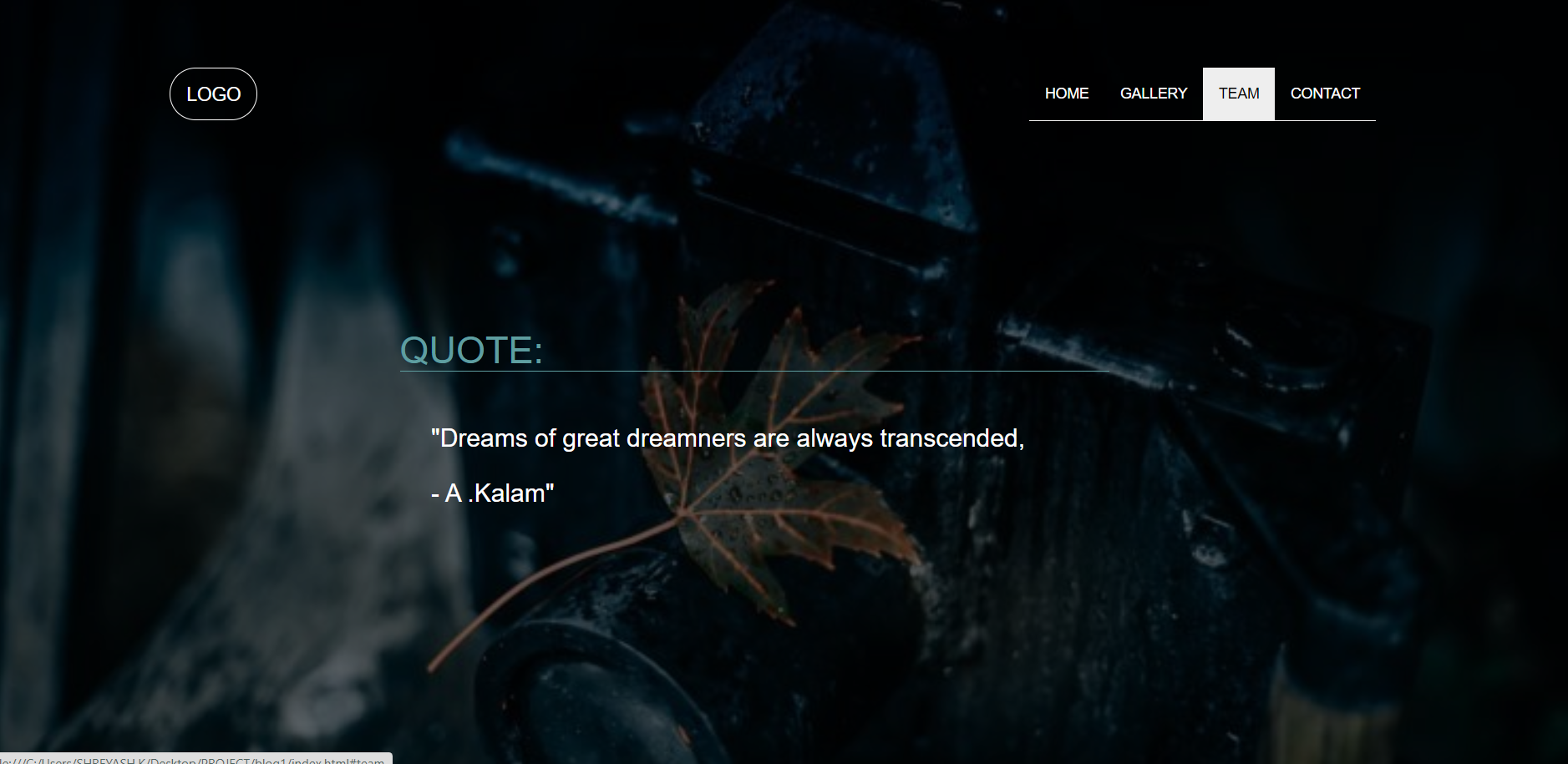
HOME
This section will contain the page which first loads on user’s screen. This will contain Logo, Menu, Text in middle, Background image.
index.html:
<div class="container-fluid home" id="home">
            <nav class="navbar">
                <div class="container">
                    <div class="navbar-header">
                        <a class="navbar-brand" href="#">LOGO</a>
                    </div>
                    <ul class="nav navbar-nav navigation" >
                        <li><a href="#home">HOME</a></li>
                        <li><a href="#gallery">GALLERY</a></li>
                        <li><a href="#team">TEAM</a></li>
                        <li><a href="#contact">CONTACT</a></li>
                    </ul>
                </div>
            </nav>
            <div class="row">
                <div class="col-sm-3"></div>
                <div class="col-sm-6">
                    <h1>QUOTE:</h1>
                    <H3>"Dreams of great dreamners are always transcended,<br><br> - A.Kalam"</H3>
                </div>
                <div class="col-sm-3"></div>
            </div>
        </div>
style.css:
.home{
    background-image: linear-gradient(rgba(0,0,0,.6),rgba(0,0,0,.6)),url(https://wallup.net/wp-content/uploads/2018/09/25/607518-leaves-dark-macro-water_drops-camera-748x421.jpg);
    background-size: cover;
}
.home .row{
    margin-top: 10%;
    margin-bottom: 15%;
}
.navbar{
    margin-top: 5%;
}
.navbar ul{
    float: right;
}
.nav li{
    border-bottom: 1px solid whitesmoke;
    text-align: center;
}
.navbar-brand{
    color: white;
    border: 1px solid white;
    border-radius: 50px;
}
.nav li a:hover{
    color: black;
}
.nav li a{
    color: white;
}
.home .row h1{
    color: cadetblue;
    margin: 50px;
    margin-left: 0;
    border-bottom: 1px solid cadetblue;
}
.home .row h3{
    color: white;
    margin: 30px;
}
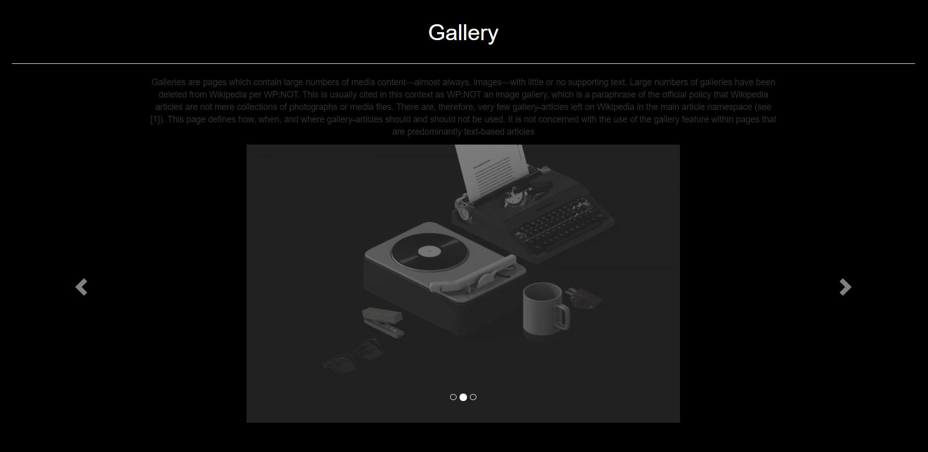
GALLERY
This section in our page will contain an image carousel with left and right swipe controls to view different images of gallery.
index.html
<div class="container-fluid gallery" id="gallery">
            <div class="container-fluid">
                <h1>Gallery</h1>
                <center><p>Galleries are pages which contain large numbers of media content—almost always, images—with little or no supporting
                text. Large numbers of galleries have been deleted from Wikipedia per WP:NOT. This is usually cited in this context as
                WP:NOT an image gallery, which is a paraphrase of the official policy that Wikipedia articles are not mere collections
                of photographs or media files. There are, therefore, very few gallery-articles left on Wikipedia in the main article
                namespace (see [1]). This page defines how, when, and where gallery-articles should and should not be used. It is not
                concerned with the use of the gallery feature within pages that are predominantly text-based articles</p></center>
                <div id="myCarousel" class="carousel slide" data-ride="carousel">
                    <!-- Indicators -->
                    <ol class="carousel-indicators">
                        <li data-target="#myCarousel" data-slide-to="0" class="active"></li>
                        <li data-target="#myCarousel" data-slide-to="1"></li>
                        <li data-target="#myCarousel" data-slide-to="2"></li>
                    </ol>
                    <!-- Wrapper for slides -->
                    <div class="carousel-inner">
                        <div class="item active">
                            <center><img src="https://hrexecutive.com/wp-content/uploads/2018/10/GettyImages-869538734broken700-700x450.jpg"></center>
                        </div>
                        <div class="item">
                            <center><img src="https://kubesystems.com/wp-content/uploads/2016/05/bg-dark-3-700x450.jpg"></center>
                        </div>
                        <div class="item">
                            <center><img src=""></center>
                        </div>
                    </div>
                    <!-- Left and right controls -->
                    <a class="left carousel-control" href="#myCarousel" data-slide="prev">
                        <span class="glyphicon glyphicon-chevron-left""></span>
                    </a>
                    <a class="right carousel-control" href="#myCarousel" data-slide="next">
                        <span class="glyphicon glyphicon-chevron-right""></span>
                    </a>
                </div>
            </div>
        </div>
style.css
/*GALLERY*/
.gallery{
    background-color: black;
}
.gallery .container-fluid{
    margin-top: 100px;
    margin-bottom: 60px;
    background-color: url(https://wallup.net/wp-content/uploads/2018/09/25/607518-leaves-dark-macro-water_drops-camera-748x421.jpg);
}
.gallery h1{
    padding-bottom: 30px;
    margin-bottom: 20px;
    border-bottom: 1px solid white;
    color: white;
    font-weight: lighter;
    text-align: center;
}
.gallery .item{
    text-align: center;
}
.gallery .item img{
    text-align: center;
}
.gallery p{
    text-align: center;
    width: 70%;
}
OUR TEAM
This section of our page will display 3 team members in form of cards. The cards will contain personal information about each member.
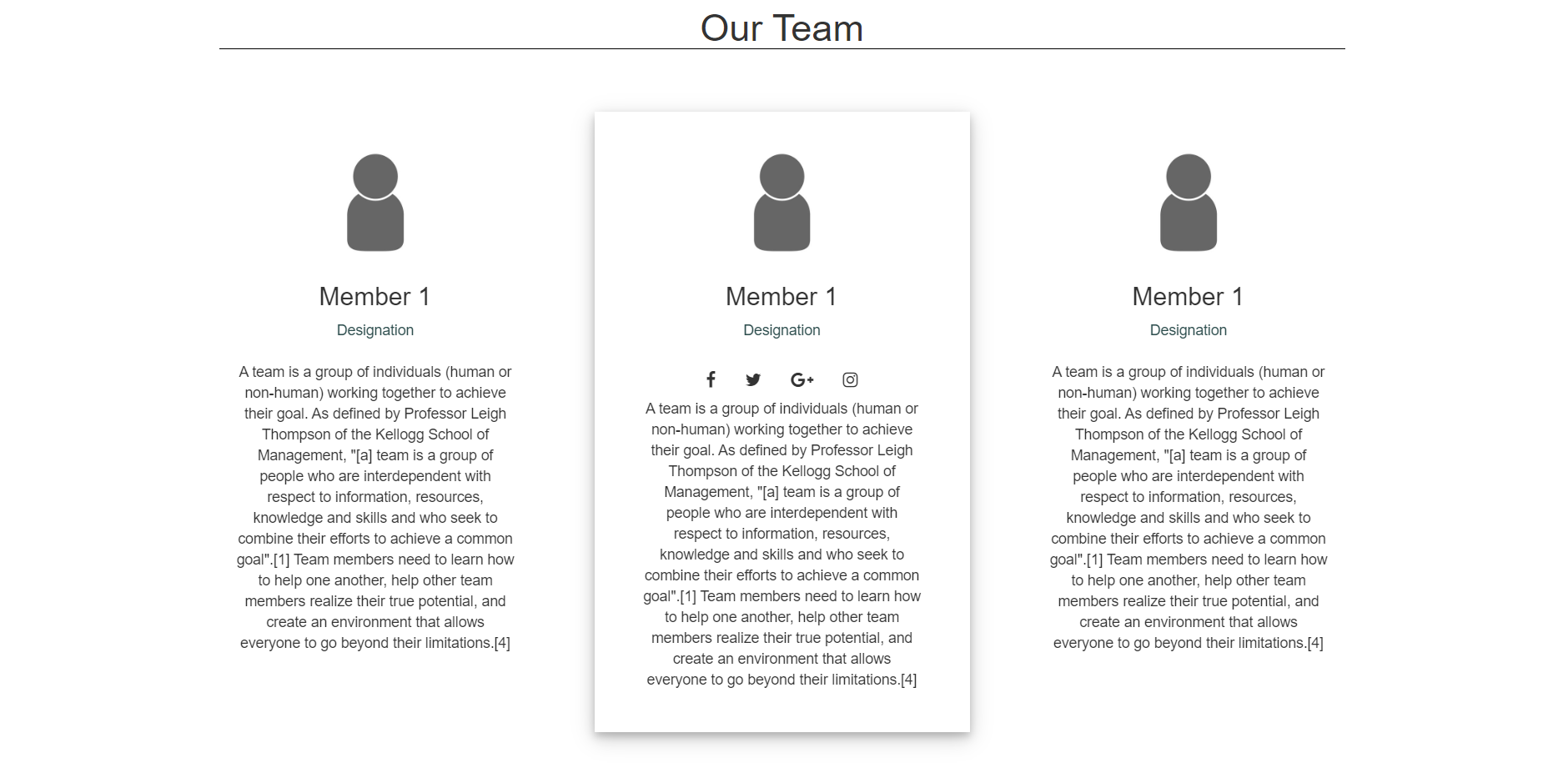
index.html
<div class="container-fluid team" id="team">
            <div class="container">
                <h1>Our Team</h1>
            <div class="row">
                <div class="col-sm-4">
                    <center>
                        <div class="shift s1">
                            <img src="https://biobaseddelta.com/wp-content/uploads/2018/08/person-450x340.jpeg" />
                            <h3>Member 1</h6><span>Designation</span><br><br>
                            <i class="fa fa-facebook"></i><i class="fa fa-twitter"></i><i class="fa fa-google-plus"></i><i
                                class="fa fa-instagram"></i>
                            <center>
                                <p>
                                    A team is a group of individuals (human or non-human) working together to achieve their goal.
                                    As defined by Professor Leigh Thompson of the Kellogg School of Management, "[a] team is a group of people who are
                                    interdependent with respect to information, resources, knowledge and skills and who seek to combine their efforts to
                                    achieve a common goal".[1]
                                    Team members need to learn how to help one another, help other team members realize their true potential, and create an
                                    environment that allows everyone to go beyond their limitations.[4]
                                </p>
                            </center>
                        </div>
                    </center>
                </div>
                <div class="col-sm-4">
                    <center>
                        <div class="shift s1">
                            <img src="https://biobaseddelta.com/wp-content/uploads/2018/08/person-450x340.jpeg" />
                            <h3>Member 1</h6><span>Designation</span><br><br>
                                <i class="fa fa-facebook"></i><i class="fa fa-twitter"></i><i class="fa fa-google-plus"></i><i
                                    class="fa fa-instagram"></i>
                                <center>
                                    <p>
                                        A team is a group of individuals (human or non-human) working together to achieve their goal.
                                        As defined by Professor Leigh Thompson of the Kellogg School of Management, "[a] team is a group
                                        of people who are
                                        interdependent with respect to information, resources, knowledge and skills and who seek to
                                        combine their efforts to
                                        achieve a common goal".[1]
                                        Team members need to learn how to help one another, help other team members realize their true
                                        potential, and create an
                                        environment that allows everyone to go beyond their limitations.[4]
                                    </p>
                                </center>
                        </div>
                    </center>
                </div>
            </div>
        </div>
        </div>
style.css
/*TEAM*/
        .shift{
           text-align: center;
           background-color: #fff;
           padding: 30px;
           margin-top: 30px;
           margin-bottom: 50px;
           width: 100%;
           position: relative;
       }
       .shift .row{
           margin-top: 50px;
           margin-bottom: 50px;
       }
       .team h1{
           text-align: center;
           border-bottom: 1px solid black;
           margin: 30px;
       }
       .shift:hover{
           box-shadow: 0 4px 8px 0 rgba(0, 0, 0, 0.2), 0 6px 20px 0 rgba(0, 0, 0, 0.19);
       }
       .shift i{
           font-size: 0;
           padding: 0;
           margin-left: 5px;
           margin-right: 5px;
           border-radius: 60px;
           visibility: hidden;
       }
       .s1:hover > i{
           visibility: visible;
           font-size: 17;
           padding: 8px;
           border: 1px solid white;
           transition: 0.3s;
       }
       .team img{
           text-align: center;
           width: 50%;
           height: auto;
       }
       .team p{
           width: 90%;
       }
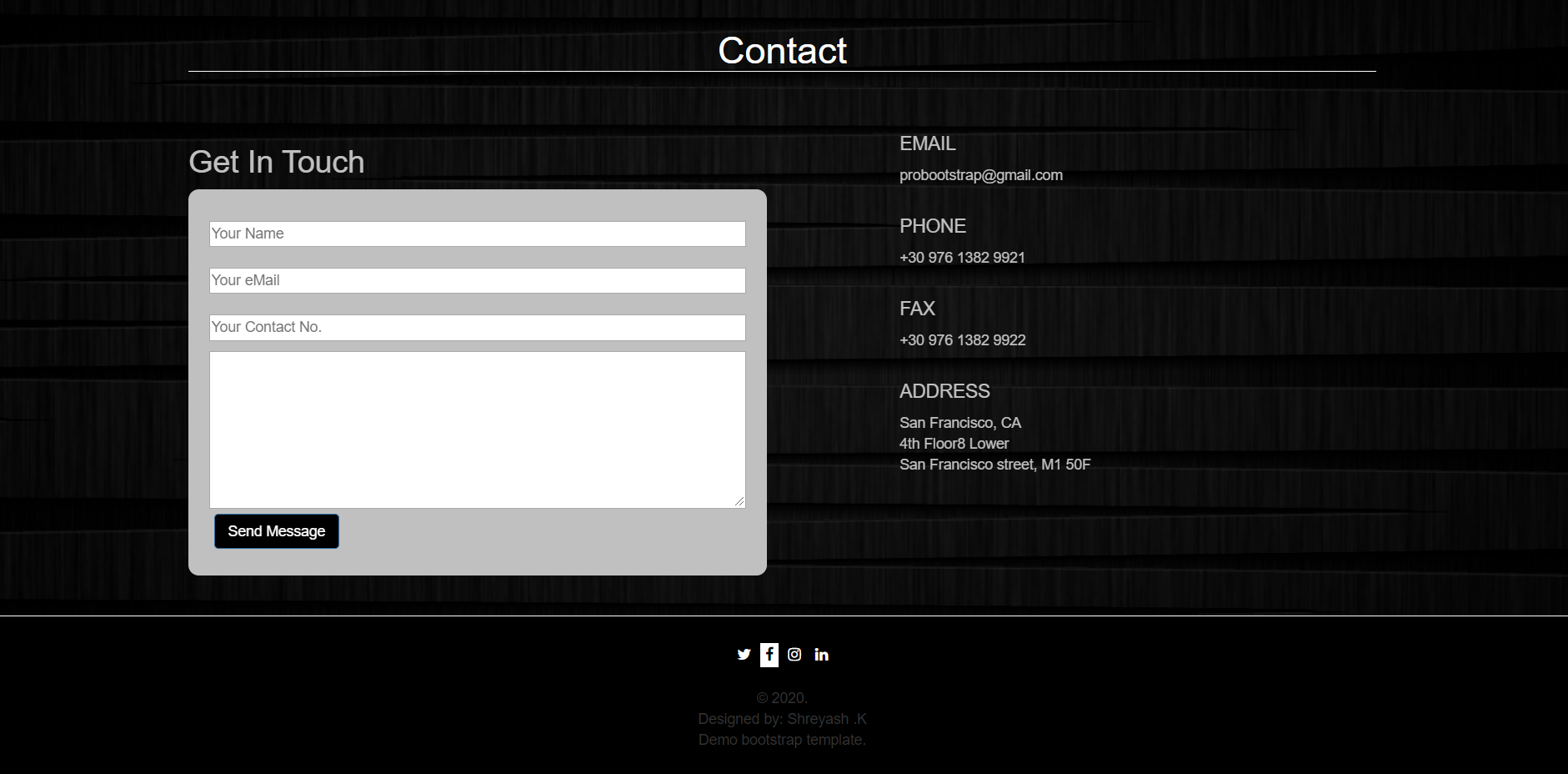
CONTACT
This section will contain a contact form (made using form tag) and other contact details. At the end of the page there is a simple footer section.
index.html
<div class="container-fluid contact" id="contact">
    <div class="container">
        <h1>Contact</h1>
        <div class="row">
        <div class="col-sm-6">
            <h2>Get In Touch</h2>
            <form>
                <input type="text" placeholder="Your Name" required><br>
                <input type="email" placeholder="Your eMail" required><br>
                <input type="number" placeholder="Your Contact No." required><br>
                <textarea></textarea>
                <button type="submit" class="btn btn-primary x">Send Message</button>
            </form>
        </div>
        <div class="col-sm-1"></div>
        <div class="col-sm-5">
            <h4>EMAIL</h4>
            probootstrap@gmail.com<br><br>
            <h4>PHONE</h4>
            +30 976 1382 9921<br><br>
            <h4>FAX</h4>
            +30 976 1382 9922<br><br>
            <h4>ADDRESS</h4>
            San Francisco, CA<br>
            4th Floor8 Lower<br>
            San Francisco street, M1 50F<br>
        </div>
        </div>
    </div>
</div>
<div class="container-fluid foot">
    <i class="fa fa-twitter" aria-hidden="true"></i>
    <i class="fa fa-facebook" aria-hidden="true"></i>
    <i class="fa fa-instagram" aria-hidden="true"></i>
    <i class="fa fa-linkedin" aria-hidden="true"></i><br><br>
    © 2020.<br>
    Designed by: Shreyash .K<br>
    Demo bootstrap template.
</div>
style.css
/*CONTACT*/
.contact{
    background-image: linear-gradient(rgba(0,0,0,.7),rgba(0,0,0,.7)),url(https://www.pixelstalk.net/wp-content/uploads/images2/Free-Hd-Dark-Wallpapers-Images.jpg);
    background-size: cover;
}
.contact .container h1{
    color: white;
    text-align: center;
    border-bottom: 1px solid white;
}
.contact .container h2{
    color: silver;
}
.contact .container{
    margin-top: 50px;
    margin-bottom: 25px;
}
.contact form{
    background-color: silver;
    padding: 20px;
    border-radius: 10px;
}
.contact .row{
    margin-top: 50px;
}
.contact form input{
    width: 100%;
    margin: 10px;
    margin-left: 0;
    height: 25px;
}
.contact form textarea{
    width: 100%;
    height: 20%;
}
.contact form button{
    background-color: black;
    margin: 5px;
}
.contact .col-sm-5{
    color: silver;
}
.foot{
    text-align: center;
    padding: 25px;
    background-color: black;
    border-top: 1px solid white;
}
.foot i{
    color: white;
    padding: 5px;
}
.foot i:hover{
    background-color: white;
    color: black;
    transition: 0.4s;
}
And our first bootstrap website design is ready!
Hope you enjoyed it. You can now create more such designs using even more variety of elements and classes provided by bootstrap. Try experimenting different combinations of styling and make your design attractive to the viewer.
Thank you!
keep learning, keep growing.
YANTRIKA DIVISION,