Modern Portfolio Theory – Markowitz Model

Reading Time: 6 minutes

Introduction


Modern Portfolio Theory - Markowitz Model


Since this concept is unknown to a lot of non-finance grads, I’ll try my best to cover the topic as quickly as possible, and yet make it explainable.
We all have some dreams about how we’re going to spend our lives. And most of these dreams may require us to be financially sufficient, if not rich. And when I say that, I am sure everyone thinks about either starting-up something or investing. Here we’re going to focus on the later. Everyone knows the importance and benefits of investment, and types of financing options available for any investment. Sadly, while many have mentally accepted they’d want to invest when they start earning, a very few know how to!
Modern Portfolio Theory, henceforth referred to as MPT, is the starting point to understand the world of investments, mathematically.
Harry Markowitz suggested the MPT in 1952 for which he won the Nobel Prize in Economic Sciences later.

Understanding the parameters of MPT

MPT is an entirely risk-return based assessment of your Portfolio. This means all it looks for is how to maximize your returns for a given amount of risk. It assumes that different people have a different risk-taking attitude. A young person would be willing to take a greater risk if it might generate him greater returns. While someone who is old, would not be willing to take higher risks and would remain satisfied with lower returns. Whatever the risk attitude, it tries to search for the ‘combination’ of assets in the Portfolio that would generate the highest possible returns (for some risk).
I hope we are clear with the very basic idea of what MPT is. Now let’s briefly understand how MPT defines risk and return for its assessment.
According to MPT, returns are simply the profit you make on an asset over a period of time. It would be negative in case of a loss. Obviously, this is very much intuitive.

Mathematically, R is the percentage change in the value of assets.

R = [(V – Vo)/(Vo)]X100

Risk, according to Markowitz, can be expressed using the standard deviation of returns over a period of time. Recall from your high school statistics, the standard deviation is the measure of how deviated the values are from their mean. So, the logic here is, if the returns more largely deviate from their mean values, the asset having those returns is more volatile. More volatility naturally means its riskier. Look how I emphasized on ‘according to Markowitz’. This is because, there are several methods of risk assessment (eg. VaR, CVaR, Conditional Risk, etc). This is because different people have different notions of what risk means to them. For some, it is how large their return could be on the negative side. For some, by what probability they can suffer an X% of loss on a standard normal distribution of their returns (essentially, the Z-Score). Anyway, to understand MPT, we need the basic definition of risk as described by Markowitz.

Mathematically, Risk (σ) = std(returns over that period)

Now, this is how we can calculate the risk and return of an asset. But obviously, we are not going to invest in a single asset. So more important value to us is the risk and return of your entire Portfolio. Consider a portfolio with N number of assets.

The expected return Ro on each one of these N Assets is the average of per period return R calculated using the percentage change formula discussed before.

R0(single asset) = mean(R of the asset)

Now that we have net expected Return for each of N assets, the net returns of the Portfolio as a combination of all the assets is simply the weighted average. Its obvious, isn’t it? Return is a linear quantity.
So if W1, W2, W3,..Wn are the weights of investment done in each of the Assets, the Portfolio Return (π) is,

π = mean(W.R) ∀ N assets.

Pretty easy right? Now, what would be the risk of entire Portfolio. Weighted average of the individual asset risks? NO!
Remember, risk isn’t a linear quantity plus, the net risk of entire Portfolio will also depend on how one asset moves relative to the rest in the Portfolio. Example, it is generally observed that when markets plummet, gold prices soar (because gold is universal in its value, and people trust it more than cash). Hence if the equities in your Portfolio go down, the gold will rise. We can see a co-dependence of assets with each other, which will also influence the risk of the entire Portfolio.
Hence mathematically,

σ(portfolio) = ΣΣ(Wi.Wj.σi.σj.ρij) ∀ i,j in N

where, ρ(i,j) = correlation between ith and jth asset.

The quantity σi.σj.ρij is also called Co-variance, σ(i,j). Now that we’ve understood the parameters of MPT, let’s get into a very easy and beautiful way to analyse portfolios – graphs.

The Risk-Return Space

The best way to understand and portfolios is to plot the risk and return of each portfolio for a variety of weights W1….Wn, and choose the perfect one for your needs. That ‘perfect’ Portfolio would be the one providing the highest return for a given amount of risk. For a 2-Asset portfolio, the risk-return space looks something like this –


Modern Portfolio Theory - Markowitz Model


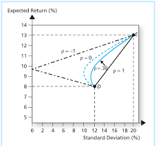
Look how different correlation values between the assets changes the portfolio curve. This curve is plotted by changing the weights assigned to each Portfolio, W1, W2. where W<1 and W1+W2=1
As the weights are changed, the portfolio return and risk change and hence the curve. One beautiful observation which is the heart of Modern Portfolio Theory, is that as the correlation approaches closer to negative values, the return one can get for a particular amount of risk increases. This is because less the correlation more differently, the assets will move respect to each other and as it turns negative, they essentially would move opposite to each other just like the gold-equity example discussed before.
So far, so good. What happens to the curve when there are more than 2 assets. Now there wouldn’t be a single curve connecting 3 assets as in 2 asset case. This is because for every point on the curve between Asset A and B and Asset B and C, there would be an another portfolio X and Y. Hence the risk-return plot in any case of N>2 will actually be a space and not a simple curve.


The Efficient Frontier


Modern Portfolio Theory - Markowitz Model


This is an algorithmically generated Portfolio Space for 4 Assets and 1000 different portfolios constructed by altering W1, W2, W3, W4 such that each is less than 1 and sum is 1.

Look at the above space plot carefully. Keeping in mind that one would always be looking to invest in portfolios with a higher return for certain risk. We get a series of portfolios which would be ideal for us if the above condition is considered that is more return for a particular risk. That will be achieved if we invest on any point on a unique curve such that the curve represents the highest possible return for some risk. This curve will be the yellow curve plotted with space. Hence as long as you’re on the upper part of yellow curve, you’re an efficient investor. This curve, as described by the MPT, is termed as the “Efficient Frontier”. The efficient frontier development mathematically is a quadratic convex optimization problem here solved using python’s SciPy library with its convex optimizer. We will, in later blogs, discuss how we can use python to generate this efficient curve along with the portfolio space.

Conclusion

We come to the most beautiful conclusion in the world of Finance. There are a unique set of portfolios which offer you more return for risk as compared to other possible portfolios. Now go back and imagine you being an independent investor having X amount of money wanting to invest in N Assets. Instead of randomly listening to news, people or read articles, you now have trusted mathematical way to construct a perfect portfolio to plan for your dreams.

Hmm. But if this were so easy, everyone would have learnt MPT and made money. But that’s not the case. Probably there are some caveats to it too. This and a lot more in the following blog. Until then keep following CEV Blogs!

Simpson’s Paradox : When Statistics lie (1 / 3)

Reading Time: 5 minutes

Simpson’s Paradox : When Statistics lie (1 / 3)

Introduction

What if I told you sometimes statistical inferences show exactly opposite than what is the reality!? Sometimes the fractions lie to us. Sometimes there are hidden parameters out there which hide in plain sight and cause us to wrongly interpret studies. Simpson’s Paradox is one of them.

The cause is so simple yet non-intuitive that even great researchers make mistakes. There have been legal issues due to wrong interpretations of data, leading to degrade in reputations. All due to one – Simpson’s Paradox!

Not only that, almost all public health research work on the philosophy of which one is better : Which “drug” is better?, Which “medical policy” is better?, etc. In short, almost every final decision is taken by comparing numbers and fractions. What if the answers are the wrong side of paradox? We choose the wrong drug, the wrong policy, the wrong solution!

I present you the first article of a 3 – article series on Simpson’s Paradox.

Simpson’s Paradox : When Statistics lie (1 / 3)


History

UC Berkeley Gender Bias :

Simpson’s Paradox : When Statistics lie (1 / 3)


One of the best-known examples of Simpson’s paradox is a study of gender bias among graduate school admissions to the University of California, Berkeley. The admission figures for the fall of 1973 showed that men applying were more likely than women to be admitted, and the difference was so large that it was unlikely to be due to chance.


Simpson’s Paradox : When Statistics lie (1 / 3)


But when examining the individual departments, it appeared that six out of 85 departments were significantly biased against men, whereas only four were significantly biased against women. In fact, the pooled and corrected data showed a “small but statistically significant bias in favor of women.” The data from the six largest departments are listed below, the top two departments by number of applicants for each gender italicized.


Simpson’s Paradox : When Statistics lie (1 / 3)

[DataTables taken from Wikipedia]


So what just happened here? When the data was looked after segmentation it revealed a clearly opposite answer! If we look closely in the above table, we can see that women tend to apply at more competitive departments with fewer acceptance rates. Look at departments D, E, and F. Acceptance into these departments was very less. However, women still applied to them. While men tend to apply in departments with greater acceptance rates. Hence net acceptance (when the acceptance into all the departments was clubbed), women acceptance appeared to be far lesser.

Problem solved! However, this particular issue cost UC Berkeley its reputation.

The Drug Paradox : 


Simpson’s Paradox : When Statistics lie (1 / 3)

This is a fictional example which is like a “Hello World” to Simpson’s paradox. Consider two drugs Drug A and B. We need to analyze which drug is better and we do it by comparing how many people were cured by each. The one with better cure rate is, of course, the better drug. Consider the following situation. A total of 200 hundred people were examined for 2 days, a 100 with A and the rest with B. The results of the cure rate was as followed :


Simpson’s Paradox : When Statistics lie (1 / 3)


Looking at the following data, we can say Drug B was a better performer on both Day 1 and Day 2. Day 1 cure percentage was 80% and for Day 2 it was 50% while the same for Drug A was 70% and 40% respectively. Just by looking at segmented information one might say “Hey buy Drug B, it’s better!” Now look at the net figures for Day 1 and Day 2. Clearly Drug A is better here!! Cure rate for Drug A is 67% while for B it is 53%. Paradox! So what should we say? Which one’s better? There’s a wonderful saying in statistics

Correlation does not imply Causation!

What we did in the first scenario is we looked at the daily basis of results. What we call this in statistics is we checked correlation for Day 1. Yes Drug A performed better on a daily basis however it was just due to a large difference in the number of people surveyed on each day i.e only 10 people were surveyed with Drug B on Day 1 while 90 were for Drug A. A similar case is observed for Day 2. This tends us to make a wrong conclusion.

So which one is better? Drug A of course because in total Drug A’s cure rate is far better than Drug B.


Implications

As I had discussed in the introduction paragraph, there are many painful implications of this paradox. A Data Analyst should hence look carefully before making any analysis. A Data Analyst could be anyone – A physicist, Computer Scientist, Mechanical Engineer testing a pump for its efficiency characteristics, Airport Engineer. That’s the reason everyone should have his / her results tested against the paradox.

My Face off with Simpson’s Paradox:

In my leisure, I generally do a lot of Data Analysis. My first confrontation with Simson’s Paradox was when I was Analysing the Barcelona accidents dataset on Kaggle. If you are particularly interested in the data analysis I performed, you can check it on my GitHub repository. If I hadn’t known about the paradox while working on the dataset, I would have wrongly concluded that nights are safer in terms of serious accidents. Which however was not the case. And so I saved myself from being blinded by this paradox:)

So how should we look after the data? Segmenting it or considering after adding all the values? I wanted to keep the first post without mathematics. In the next post, I would address the paradox with a mathematical rigour! Until then keep reading and enjoy CEV Blogs.


Flight Radar : Building your own simple, real time Flight Monitor using Python

Reading Time: 8 minutes

Flight Radar : Building your own simple, real time Flight Monitor using Python

Introduction

According to a previous year report, there were around 9728 planes – carrying about 1,270,406 people – in the sky at a given moment! How are all the flights controlled and avoided from colliding with each other? Well, there are complex systems which monitor real-time sky traffic and provide necessary details to the pilot. In case the projectiles of two or more flights meet, a warning system is activated and the necessary plan to escape the collision is provided.

The aim of this article is not to inform you about ATC processes, however, we would be using the data from the servers of ICAO to make our own simplistic Flight Radar.  Every aircraft in air is assigned its own ICAO 24-bit address. This unique address of an aircraft is then used to access some important information like the location (latitude, longitude), flight altitude and velocity.


Pre Requisites

  1. Basic knowledge of Python and handling of Jupyter Notebooks.
  2. Python, pip, and git installed on your machine.
  3. Working with the terminal.
  4. Libraries – Matplotlib, Basemap

If new to these points I advise you to look out for the Anaconda distribution. If you are on Windows, working with Anaconda Prompt is the best and easiest way to deal with development processes in python.

The basic requirement of our code is to fetch information from the ICAO 24 – bit address of each aircraft we care about. Well, there is a very simple and effective tool available for this. The Open Sky API! Just a call to this API will help us fetch the details of the aircraft we are looking for! 90% of the work done right?! That’s why I love APIs.


Installing required packages

Now I advise you to make a separate folder, where you’ll work.

Matplotlib

Flight Radar : Building your own simple, real time Flight Monitor using Python

If you have Anaconda distribution you’ll be already having matplotlib installed. Matplotlib is a powerful Python library for fantastic data visualizations. If you are interested and passionate about visualizations I advice you to take a separate tutorial on matplotlib (and seaborn).

If you don’t have anaconda installed, you can fetch the package from the Python Package Index (PyPI).

Just run the following in your terminal

pip install matplotlib

Matplotlib – Basemap

Flight Radar : Building your own simple, real time Flight Monitor using Python

Now we need Basemap. Basemap was developed by the same developers who had worked on matplotlib. Those were the years when python was being shaped into a multi-functional, easy to use, research-oriented language it is now. Ahh, the golden years of python!

Noo! Let’s not deviate!

Basemap offers easy integration with matplotlib, a very necessary function for our code to work. There are many other GIS specific great libraries in python but since we need integration with matplotlib ( and basemap is the only one I’ve worked with:) ) we will go with basemap. If you’re having conda it’s easy.

conda install -c anaconda basemap

If you do not have conda you need to clone the basemap github repository and then run setup.py

git clone https://github.com/matplotlib/basemap.git

Move to the directory where the repo is cloned and run

python setup.py install

Open-Sky Network API

Flight Radar : Building your own simple, real time Flight Monitor using Python

The API is not available on either conda cloud or PyPI and so it requires manual installation.

git clone https://github.com/openskynetwork/opensky-api.git
cd opensky-api/python
python setup.py install

High-Resolution Maps : Basemap (Optional)

By default, basemap has very minimalistic maps installed with it. However, if we really care about the deep details of our maps we should separately install high resolution maps. However this means our code will take more time to process since it requires to render such high detailed maps.


Let’s Code!

Flight Radar : Building your own simple, real time Flight Monitor using Python

Now let’s open up our Jupyter Notebooks and import the required packages. In the same directory where you’ve installed OpenSky API, open jupyter notebook by simply typing in

jupyter notebook

Importing requirements

import matplotlib.pyplot as plt
from opensky_api import OpenSkyApi
from mpl_toolkits.basemap import Basemap
from IPython import display

All the plots made by matplotlib are stored at a specific memory location while the code runs. When we run the code, it by default prints a message telling us where the plot is saved. However, if instead, we want all the plots to be displayed as soon as they are made inside our notebook we need to inform it explicitly.

%matplotlib inline

Now let’s define a function which will help us fetch the latitude and longitude of the flights (called states in OpenSky API documentation). Now by default, the OpenSky API returns the states of all the flights in contact with the ICAO servers. We do not want the details of all the flights in the sky. What we will do is define a box using latitude, longitude coordinates of its corners and fetch the data of only that box. This box will be over Indian Airspace. Hence we will fetch the details of flights only over Indian Airspace. Since it is a large area we will display the real-time movements of flights only in the region south of Tropic Of Cancer, which has some of the important Indian airports and also hosts many international flight routes.

The latitude, longitude coordinates can be easily known from Google Maps by clicking at random points within our desired box.

Let’s define a function which returns the latitude, longitude coordinates of the flights in the box specified.

def coordinates():
    api = OpenSkyApi()
    lon = []
    lat = []
    j = 0
    # bbox = (min latitude, max latitude, min longitude, max longitude)
    states = api.get_states(bbox=(8.27, 33.074, 68.4, 95.63))
    for s in states.states:
        lon.append([])
        lon[j] = s.longitude
        lat.append([])
        lat[j] = s.latitude
        j+=1
    return(lon, lat)

Here  api.get_states(…) helps us define the box under which we need to fetch the flights’ data. Here the bbox covers Indian Airspace. This code snippet is already commented and so it’s not difficult to understand. The loop iterates over all the states fetched from the bbox specified and we extract only the latitude and longitude out of it. At last, the (lat, lon) lists are returned which now possess the location of every flight over the Indian Airspace at the time you are reading this!

Now let’s plot the coordinates fetched on the Indian Airspace. As mentioned, to properly visualize the aircrafts’ movements over space we would consider only the region of Indian Airspace below the Tropic of Cancer.  

What we will do here is plot the map with the coordinates on it and then re-plot for a certain number of times. Every time a new plot is displayed, coordinates of flights are shown for the time when the API was called. Since there is some inherent time taken by the code to print the high-resolution map, the next time we fetch the data from the API, we receive updated coordinates. This will help us show the exact path of each aircraft.

To display the plots one after the other it’s obvious we will use an iteration and plot the map for every iteration. Let’s also ask the user the number of iterations he/she wants to make it a bit interactive.

print("How many Iterations?")
a = int(input())

Now let’s code the iteration.

for i in range(1, a + 1) :
    fig_size = plt.rcParams["figure.figsize"]
    fig_size[0] = 20
    fig_size[1] = 20
    plt.rcParams["figure.figsize"] = fig_size
    lon, lat = coordinates()
    m = Basemap(projection = 'mill', llcrnrlat = 8.1957,   urcrnrlat = 23.079, llcrnrlon = 68.933, urcrnrlon = 88.586, resolution = 'h')
    m.drawcoastlines()
    m.drawmapboundary(fill_color = '#FFFFFF')
    x, y = m(lon, lat)
    plt.scatter(x, y, s = 5)
    display.clear_output(wait=True)
    display.display(plt.gcf())

Let’s break down and understand this for – loop step by step

fig_size = plt.rcParams["figure.figsize"]
fig_size[0] = 20
fig_size[1] = 20
plt.rcParams["figure.figsize"] = fig_size

What this chunk of code does is set a size to the plot image displayed in the Jupyter Notebook. By default the size is insufficient for us to monitor all the flights.

lon, lat = coordinates()

This is pretty obvious. coordinates function is called and the lists with the values of flight latitudes and longitudes are stored in the lists lat and lon respectively.

m = Basemap(projection = 'mill', llcrnrlat = 8.1957,   urcrnrlat = 23.079, llcrnrlon = 68.933, urcrnrlon = 88.586, resolution = 'h')

This code segment creates a basic Basemap. In cartography, there are many projections available to choose from. The miller projection is the simplest form of flat maps that we generally see. If you want to read more about map projections you can do it here.

llcrnrlat is just an abbreviation to lower left corner latitude. What these 4 variables do is again define a region for which the map has to be generated. In this case, it is the Southern part of India. I have set the resolution to high (‘h’) to render really high-quality maps. If you think it uses a lot of compute you can switch to lower quality by setting resolution = ‘c’ instead.

m.drawcoastlines()
m.drawmapboundary(fill_color = '#FFFFFF')

I think this is pretty readable. It draws coastlines and boundary for the map and sets map color to white.

x, y = m(lon, lat)
plt.scatter(x, y, s = 5)

This segment at last prints the coordinates on the basemap. plt.scatter(…) is actually a matplotlib function. This is where the integration comes into the picture which we had discussed in the introduction paragraph. Both the basemaps and scatterplot we created are plotted on single axes providing us with the final map!

display.clear_output(wait=True)
display.display(plt.gcf())

As soon as the plot is generated and printed the next time a plot is generated we need to remove the previous plot and display the present one. This code does exactly the same thing and hence adds “motion“ to the flights plotted!

This is how the final plot looks like:

(look closely, this is a GIF which is exactly how your actual output will look like)

Flight Radar : Building your own simple, real time Flight Monitor using Python


CEV - Handout